Website Motion Design: How Animation Shapes UX
I used to treat motion as the last stage of the design process. I would design the screen, build it, then add a few animations at the end so everything feels good, and that was it.
But after designing for 4 years and experiencing good digital experiences, I started observing how motion affects the way any website or digital product feels. It is one of the first things user experiences, before they read headline or even understand what you do. The way things move already tells them something about the brand and the experience they are about to have.
I’ve been reading and experimenting with motion a lot lately, and these are the 3 ideas that have changed how I think about motion. If you’re just getting started, they’re a great place to begin with whether you’re a UX/UI designer or a web developer trying to use motion more intentionally.
Big things move slowly, small things move faster
The size of a thing should decide how fast it moves.
Think about a door and a light switch. The door is heavy. It swings open slowly and settles. The switch is tiny. It flicks. Nobody expects a door to flick, and nobody expects a switch to swing.
Screens work the same way. A big hero image, a full-width card, a modal, all of these feel heavy. Give them time to move and a soft landing. Rush them and they look like they’re being yanked across the screen. A small icon or a toggle is light. It can move fast and snap into place, and that feels right.
Here’s the part most people miss. Most sites use the exact same speed and the same easing for everything. One setting, applied everywhere. That’s why many websites and apps feel off even when nothing is statically broken.
Most sites and apps use one animation speed for everything on the page or screen. That’s why they feel off even when nothing is visually broken.

Real numbers you can start from
I used to guess how much duration should I have on a any animation. Then I found the NNG's (Nielsen Norman Group) guidance on this, and it lines up with exactly what I’d been feeling but couldn’t put numbers to. Their rule is that duration should depend on how far and how big the moving thing is.

One more thing from NNG's guidance that I now use everywhere. Things coming onto the screen should take longer than things leaving. A popup might take 300ms to appear and only 200ms to go away. Small change but big difference in how it feels.
And whatever you pick, ease it. Linear motion, where something moves at exactly the same speed from starting to finishing, is the fastest way to make any screen feel lifeless. That’s the one thing every good motion design resource agrees on.
Fast motion feels urgent, slow motion feels calm
Quick, snappy motion feels alive and energetic. Slow motion with soft fades feels calm and safe.
Every site sits somewhere on that line, whether you choose it or not.
I built the website for Sankalp De-Addiction Centre, a de-addiction and mental health centre in Beed, Maharashtra. I kept the motion slow and steady there, with soft fades instead of sharp cuts and quick motion.
Here’s why. People land on that site because someone in their family is struggling with addiction. Usually on a bad day. That site should not feel urgent or aggressive. Slow, gentle motion tells them this is a safe place before they’ve read a single line.
My own portfolio and MonoCraft (my Framer template) sit in the middle. Not sleepy, not rushed. That middle pace is what reads as trust and confidence, which is what a portfolio needs to say. MonoCraft leans a bit bolder inside that range to match the kind of work it’s built to show.
Same skill. Different answers. Because the emotion and energy of the visitors were different on each website.
Too much motion breaks the design
This is the part I wish someone had told me earlier.
Motion doesn’t only help. It can break a good design. If everything on the screen is moving, the visitor has to work out where to look. That work is real. It has a cost. Their eyes go everywhere; they take in nothing, and the thing you actually wanted them to see gets missed.
NNG put it plainly. Animation can give useful feedback and stop people getting lost, or it can be distracting, annoying, and dizzying. There’s no middle setting where it’s just decoration and does no harm.
If everything on the page moves, nothing does. The visitor can’t tell what matters.
Animate by priority, not because it feels good
The fix is simple. Rank your elements first, then animate them according to that rank.
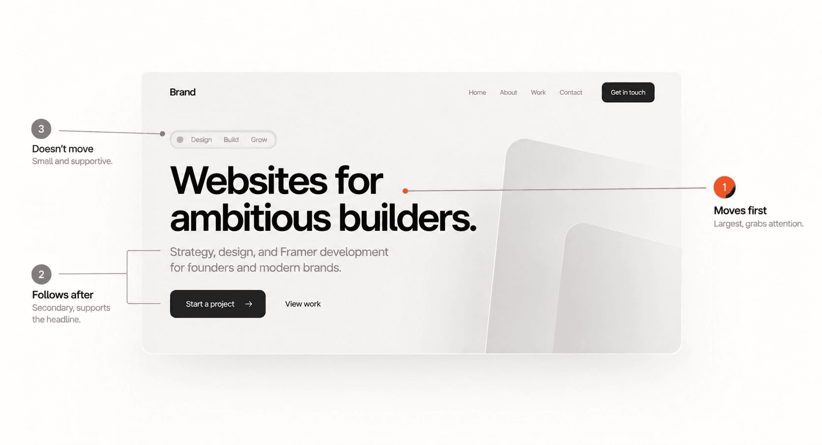
The most important thing on the section, usually is the headline or the main button, moves first and gets space to land. Nothing else competes with it. Once it settles, supporting things can come in, quieter and smaller.
And then there’s a third group people forget about entirely. Some things shouldn’t move at all.
On my own portfolio, the tagline and the small chips have almost no animation. Some of them have none. They’re supporting details. They don’t need to fight for attention, so I didn’t give them any. That was a decision, not an oversight or laziness.
Try this on your next screen. Before you animate anything, write down what’s first, what’s second, and what doesn’t move. Then build on that list.
Some people have turned motion off, and that’s fine
Not everyone wants motion. People with vestibular disorders can feel genuinely dizzy or nauseated from parallax and big sliding movements. Some people just find it tiring. Every modern operating system lets them switch motion down at the system level.
Framer respects this. There’s a setting in Site Settings that turns off parallax, transform, and layout animations for anyone who has asked their device for reduced motion. Turn it on. It costs you nothing, and it means your site doesn’t make somebody feel sick.
Setting > General > below metadata, you get the accessibility toggle! Also shown in the image below.

Good test for whether your motion is doing real work. Turn it all off and look at the page. If the page still communicates properly, your motion was an enhancement, which is what it should be. If the page falls apart, you were using motion to cover for a layout problem.
What I’d actually do on your next project
Four steps. Nothing complicated.
Write down the feeling in one word before you open Figma. Calm. Confident. Playful. Serious. Then match your motion to that word instead of picking curves and hoping a feeling turns up.
Rank every element on the screen. First, second, doesn’t move. Do this before you animate anything.
Set your durations by size. Small things fast, big things slower, using the ranges above as a starting point.
Build two or three reusable presets in Framer and use them everywhere, instead of setting each element by hand. Consistency is most of what makes motion feel intentional.
That last one saves more time than anything else on the list.
A few resources that shaped how I think about motion
None of this came out of nowhere. These are the resources that shaped how I think about motion. If you want to go deeper than this post, start here.
motion.zajno.com by Zajno. This is where I learned the most, by a distance. It’s interactive, it’s specific, and it shows real before-and-after examples instead of just describing theory. If you click one link from this post, click this one. The team behind it did an incredible job, and the site itself is a good argument for everything it teaches.
Creating Usability with Motion: The UX in Motion Manifesto by Issara Willenskomer, 2017. Twelve principles for using motion to help people rather than decorate a screen. Most serious writing on UI motion traces back to this.
UI Animation Principles: Disney is Dead by Issara Willenskomer, 2016. Argues that most of Disney’s twelve animation principles don’t apply to interfaces at all. Easing is the one that survives.
Executing UX Animations: Duration and Motion Characteristics by Page Laubheimer, Nielsen Norman Group, 2020. The source of the duration numbers above, plus the accessibility warnings. The most practical single page on this list.
Material Design 3, easing and duration by Google. The formal reference if you want exact curves to start from.
Achieving Emotional Impact Using Motion For Brands by Buff Motion, 2026. Where the first- and second-priority idea in this post comes from.
If you’re building in Framer and looking for something to practise with or draw inspiration from, explore the easing and animations in the free MonoCraft Framer template.
If your site technically works but something about it feels off, motion is mostly the reason. Happy to take a look at yours.