
What is Best Typography System
A simple type scale is better for majority of websites but its not ideal for growing digital products
You can have a Display style, a few heading sizes, body text, and something smaller for supporting information, and that is enough to build a solid marketing website or portfolio. The problems start when you take that same approach into a large product with dashboards, forms, tables, navigation, settings, metrics, alerts, and many different states.
You are no longer just deciding how big a heading should be.
You are deciding how the whole product should communicate.
That is where I think a typography system becomes useful. It gives every type style a clear role, keeps those decisions consistent across the product, and makes it easier to know what to use when a new screen or component comes along.
A type scale works until the product gets bigger
The type scale I showed in my earlier article is a good example of what I mean.
You might have Display, Heading 1, Heading 2, Heading 3, Body Large, Body, Small, and Caption. That gives you enough hierarchy for a lot of websites without making the system harder to use than the website itself.
A product is different because the text is doing more jobs.
You have a page title sitting above a dashboard. You have numbers that need to stand out from the labels around them. You have helper text under a form field, a status next to a table row, a button label, and a small message explaining what happens next. The visual hierarchy still matters, but now the purpose of the text matters just as much.
Material 2 is a good example of this because its type system contains multiple named styles for different kinds of interface content, including headlines, subtitles, body text, buttons, captions, and overlines. The styles are not just a collection of sizes. They are tied to how text is used inside the interface.
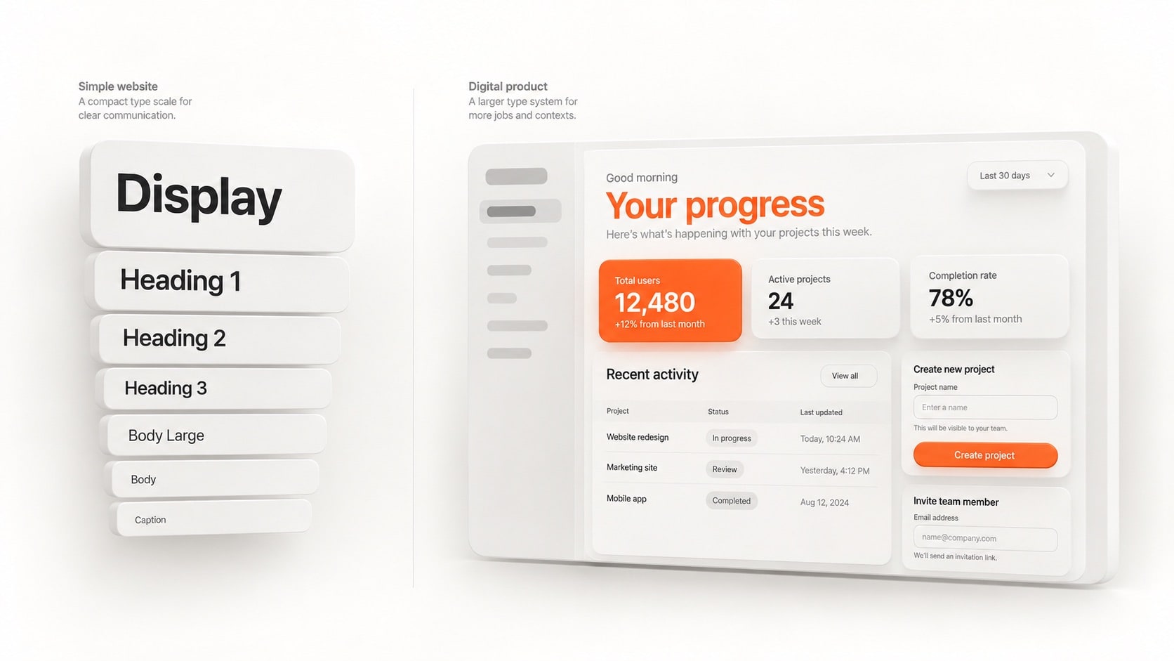
That is the point where I stop asking, “What other font size do I need?” and start asking, “What does this piece of text need to do?”
That question leads to a much better system.
I name styles by their role
When I am working on a larger product, I do not want every style to be described only by the font settings underneath it.
A style named Inter 14 Medium tells me the typeface, size, and weight. That is useful information, but it does not tell me what that text is doing in the interface. A role like Body, Headline, or Caption gives me a better starting point because I already know how that style is supposed to behave.
This becomes more useful when the same product has hundreds of components and more than one person is working on it. The next designer does not need to remember why a particular 14px style exists because the role already gives them context.
Apple has followed this idea for years with named text styles such as Body, Headline, Title, and Caption. These styles combine typographic properties into reusable roles, and Apple uses them as part of a broader hierarchy that can adapt to different text sizes through Dynamic Type.
I have used Apple's naming approach throughout my UX design career, so I still use it when I work on larger digital products. I do not think everyone needs to follow Apple's names, though. Material has its own naming system, and you can build your own as long as the names make sense to the people using the system.
The important part is not which design system you copied.
The important part is that the name helps you make the next decision.
The role stays the same even when the values change
This is where a role-based system starts making more sense.
A Body style does not stop being Body because you change its size on a smaller screen. The same thing applies when a mobile app needs larger text for accessibility or when another platform uses a different typeface. The visual values can change while the role stays the same.
Apple's Dynamic Type is built around exactly this idea. A text style such as Body or Headline gives the system a meaningful role, and the font size can then adjust to the user's chosen text size while the hierarchy remains intact. Apple also recommends using built-in text styles where possible because they are designed to scale with the system.
That is the part I find useful when moving between web and app work.
I am not copying Apple's exact sizes into every project. I am keeping the role separate from the value so I have room to make the visual decision that fits the product.
For example, Body might be 18px on a desktop web app, 16px on mobile web, and use a different platform value inside a mobile app. I still know that all three are solving the same problem: they are the main reading style for the interface.
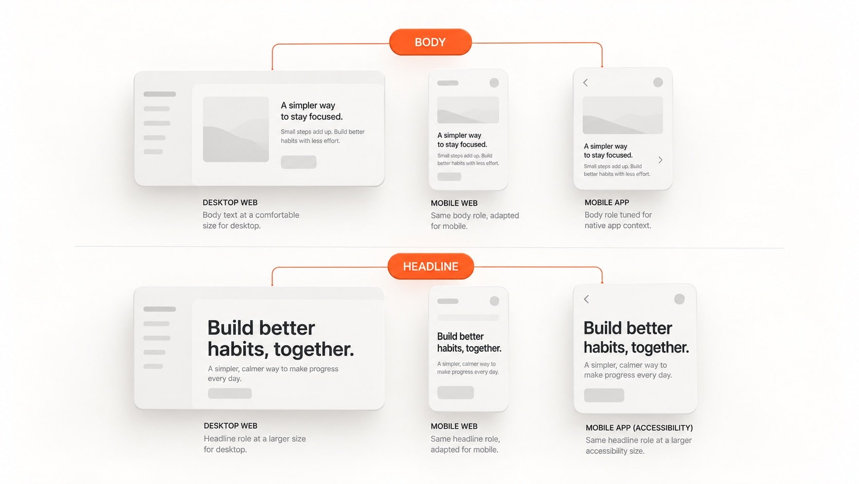
That separation keeps the system flexible without making it vague.
Before adding a new style, check the ones you already have
This is one of the rules I care about most because it is where typography systems start getting messy.
When a new screen needs something that looks slightly different, the easiest thing to do is create another style. I have done it myself. You make a smaller version of Body, then another version because a card needs something in between, and after a while the system is full of styles that are technically different but do almost the same job.
When that happens, I stop and look at the existing styles first.
If one of them already works, I use it. If the difference is only a small visual preference, I do not create another style just to make one component feel a little nicer. If the new text really has a different purpose in the product, then I am fine adding a new role, but I want to be able to explain why the existing styles could not handle it.
This is where a new style should earn its place.
The problem is not having more styles.
The problem is adding styles without adding any real meaning.
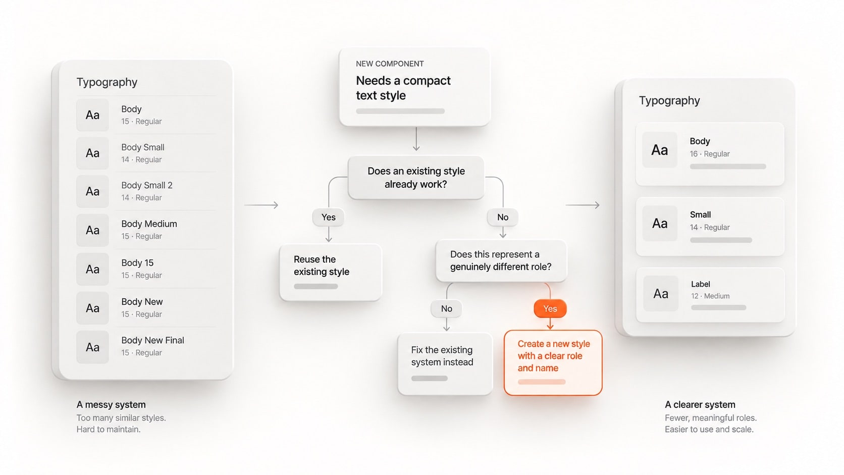
If the file has Body, Body Small, Body Small 2, Body Medium, and Body New Final, the problem is not that the team needs one more style.
The problem is that nobody has decided what those styles are for.
More styles do not automatically mean a better system
A large product needs more typography roles than a simple website, but that does not mean the goal is to keep adding styles until every component has its own one.
Material 2 is a good example because its type system has 13 global styles covering different kinds of interface content. Material 3 takes a newer role-based approach with groups such as Display, Headline, Title, Body, and Label. These systems are larger because they are built to support products with a much wider range of interface needs.
That does not mean your own product needs the same number.
I look at the product first and build the smallest system that covers the actual work. A small app with a handful of screens does not need the same typography setup as a product with a dashboard, billing area, analytics, settings, onboarding, notifications, and several different types of data.
The system should grow when the product introduces a real new requirement.
It should not grow because someone found another number that looks nice between two existing numbers.
The type system has to work inside the product
This is where I stop trusting the typography page on its own.
A type system can look perfectly balanced when you display all the styles next to each other in a design file. The real test starts when those styles are sitting inside a table with long values, a form with helper text, a card with an awkward title, or a dashboard where a metric needs to stand out from everything around it.
That is where I test the system.
I put the styles into the actual components and use real content instead of sample copy. I look at the longest heading, the smallest useful text, the busiest table, and the parts of the interface where several text roles sit close together. If the hierarchy still makes sense there, I know the system is doing its job.
Material's component guidance is built around this same relationship between typography and the actual interface. Its examples define different text roles inside components such as text fields, where labels, input text, helper text, and error text each have a different purpose.
That is the part I think is easy to miss when building a typography system from a blank canvas.
You are not designing the type system for the type system.
You are designing it for the product.
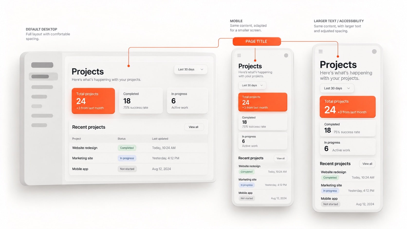
Responsive type is part of the system
A product typography system also needs to survive different screen sizes.
The important thing is not making every style have a desktop version, tablet version, and mobile version. The important thing is keeping the hierarchy clear while the values and layout adapt to the space available.
A page title may need to become smaller on mobile. Body text may use a tighter line height. A metric might need more room because the number wraps differently. The role has not changed, but the way it is presented has.
Apple's text styles are designed around this kind of adaptation, especially with Dynamic Type, where the user's chosen text size affects the visual size of the style while the hierarchy between styles remains meaningful. Apple also points out that layouts need to be checked for clipping and truncation as text scales.
That is why I think responsive typography belongs in the system from the start.
I do not want to finish the desktop interface, move to mobile, and discover that half the typography only works because I assumed every title would stay on one line.
A good system leaves enough room for the content and the person using it.
[IMAGE 05: The same product screen shown in default desktop, mobile, and larger accessibility text settings, with the hierarchy preserved while text sizes and layout adapt. Alt text: A product interface adapting to different screen sizes and larger text while keeping its typography hierarchy intact.]
Accessibility changes how I think about the system
When I design a screen, I know exactly how I want it to look.
The person using it does not have to follow my settings.
They may use larger text. They may be on a smaller screen. They may use a different device or platform. A product typography system needs to handle those situations without making the interface harder to understand.
Apple's Dynamic Type guidance is built around this. People can choose a text size that works for them, and apps that use text styles can allow those styles to scale while preserving the hierarchy of the interface. Apple also recommends checking layouts at larger text sizes because text that fits perfectly at the default setting can become truncated or clipped when it grows.
That is not just an accessibility task that happens after the design is finished.
It changes the way I build the system in the first place.
I avoid making important layouts depend on fixed text heights. I give text enough room to wrap, and I check the places where a larger text size will put pressure on the surrounding layout.
The goal is not to make the interface look exactly the same at every text size.
The goal is to keep the information easy to understand.
Do not get stuck choosing a naming convention
This is where designers can spend far too much time.
You open Apple's guidelines and see Large Title, Title, Headline, Body, Callout, and Caption. Then you look at Material and see Headline, Subtitle, Body, Button, Caption, and Overline. Material 3 has its own set of role names as well.
It is easy to start wondering which naming system is the correct one.
I do not think that is the problem you need to solve.
Pick the system that makes sense to you and the people working on the product, then use it consistently. I have used Apple's naming strategy throughout my UX career because I already understand what those roles mean and it gives me a language I can carry from one product to another.
Someone else may prefer Material's approach.
That is fine too.
The naming convention is there to create clarity. It is not the thing that makes the typography system good.
The system becomes good when the team understands what the styles are for, knows when to reuse them, and has a clear reason when something new needs to be introduced.
What I actually do when I build a typography system
I start by looking at the product and the content instead of jumping straight into font sizes.
I look at the screens, the components, and the different kinds of information the product needs to communicate. From there, I define the roles that are actually needed, choose the typeface and weights that support those roles, and build a scale that gives the product enough hierarchy without creating unnecessary styles.
Then I put those styles into real components and test them with real content.
When a new screen asks for another style, I go back to the existing system before creating anything new. If an existing role works, I reuse it. If it does not, I ask whether the new requirement is actually a different role or whether I am trying to solve a local layout problem with a new typography style.
After that, I check the important screen sizes and larger text settings so I know the system still works when the conditions change.
That process takes more thought at the beginning, but it saves a lot of cleanup later.
More importantly, it gives the whole team a shared way to make typography decisions instead of leaving every screen to its own designer.
Resources
These are the four resources I used while building this way of thinking about product typography. They use different naming systems and take different approaches, so I would read them for the ideas rather than trying to copy one system.
Apple Human Interface Guidelines: Typography
A good reference for text hierarchy, built-in text styles, readability, and how typography adapts to different text sizes. This is also the system I have used throughout my UX career, so it naturally influences how I structure product typography.
Read Apple’s Typography Guidelines →
Material Design 2: Understanding Typography
This is useful when you want to understand what actually makes up a text style, including size, weight, line height, letter spacing, and other type properties. It helped me look beyond font size when building a system.
Read Material’s Typography Guide →
Material Design 2: The Type System
This goes deeper into how a type scale is structured and applied across an interface. It is useful for seeing how different text styles work together instead of treating every size as a separate decision.
Material 3: Type Scale Tokens
This is the most useful one to look at when you are working on larger digital products and want to understand typography as a set of reusable roles and tokens. It also shows how a system can grow without turning every new requirement into a completely new style.
Explore Material 3 Type Scale Tokens →
Good Typography System Should Make the Decision Easier
When a new screen gets added, I should be able to look at the content and know which style fits without creating another one just because it looks slightly different. When the product moves to another screen size, the hierarchy should still make sense, and when someone new joins the project, they should understand the system without having to ask why every style exists.
I am not trying to build the biggest typography system or create a style for every possible situation. I want enough structure to keep the product consistent and enough flexibility to handle the situations I did not think about when I first built it.
That is what makes a typography system useful to me. It gives the team a shared way to make decisions instead of making every new screen start from zero.
If your typography system keeps growing without getting clearer
That is usually a good point to step back and look at the system again. I work across UX, visual design, and development, so I can help you simplify the typography, clean up the hierarchy, and build a system that the whole product can keep using.

