My Take On Micro-Interactions
I used to think that micro-interactions were the small animations you add when the main interface is done.
A button gets a nice press effect. A checkbox moves into place. A toast slides in instead of just appearing. None of these things is the main reason someone uses a product, but they change how clearly the product responds and communicates with them.
After working on many interfaces, I started looking at these moments differently. They are not just small polished moments. They are the part of the interface that communicates withe users / peoples whether their action worked, what changed, and what they should do next.
Thats where micro-interactions become so much useful from the UX pov.
What Micro-Interactions Actually Do
A micro-interaction usually starts when user does something, and the interface needs to respond or communicate.
For Ex: You click a button, and it changes state. You check a box, and it shows that it is selected. You submit a form, and the interface tells you whether it worked. You open a menu, and it appears where you expect it to appear.
Dan Saffer describes micro-interactions as small moments with a trigger, rules, feedback, and a loop or mode. I cant agree more because it moves the conversation away from animation and back toward the interaction itself. The animation is only part of what the user experiences.
The most important part is the feedback.
When someone clicks something, they don't have to wonder whether the click is registered or not.
Apple makes a similar point in their Human Interface Guidelines. Feedback should help people understand what is happening, what happened as a result of their action, and what they can do next.
That is a much better way to think about micro-interactions than asking, “What can I animate here?”
A Micro-Interaction Is Not Just an Animation
I think junior designers often confuse this.
A micro-interaction can use motion, but the motion itself is not a interaction.
For ex: take a login form. When someone enters the wrong password, the useful part is not the field shaking. The useful part is that the interface explains what went wrong and gives them a clear way to fix it. The shake can help draw attention to the field, but it does not solve the problem by itself.
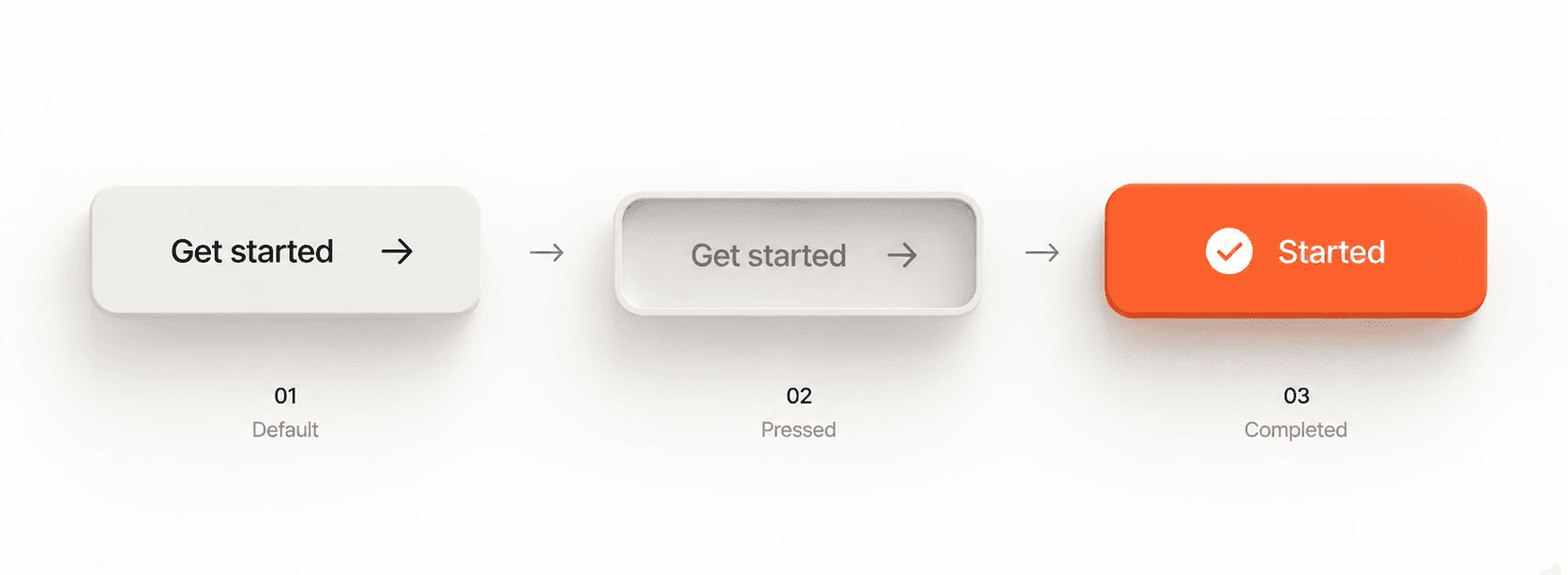
The same thing happens with a successful action. A checkmark animation looks good, but the important part is the interface makes it clear that the action was completed.
Thats why I ask "what the person needs to understand before I decide how the interaction should look."
Sometimes the answer is using the correct animation, sometimes it is a communicated in text and sometimes it is a different state, a message, or a new piece of information appearing.
I think the best micro-interaction is not the visible one but it is the one that gives the right information at the right time.
Feedback vs. Decoration
I think I have found the easiest way is to separate useful interaction from decoration is to remove the motion and look at what is left there.
Suppose a checkbox changes from empty to checked without any animation. The state is still clear, so the animation is helping make the change easier to notice, but it is not carrying the entire meaning. right?
Now think about a loading state. If a button changes but gives you no indication that something is happening, you may click it again because you are not sure whether the first click worked or not. The feedback there is doing a job because it tells you that the system received your input/action and is currently working on it.
Thats the difference I care about.
Feedback carries information.
Decoration adds visual interest.
There is nothing wrong with decoration, but it should not be confused with UX feedback. NNG (Nielsen Norman Group) makes a similar distinction in its guidance on animation. Its main use in interfaces is to support feedback, state changes, navigation, and understanding rather than entertaining the user.
Do this test next time, ask: What would the user understand less clearly if I removed this?
If the answer is “nothing,” the animation might still be nice, but it is optional.
If removing it makes the action harder to understand, then it is doing useful work.
Where Most Designers Miss the Timing?
The timing is where a good micro-interaction starts to feel odd.
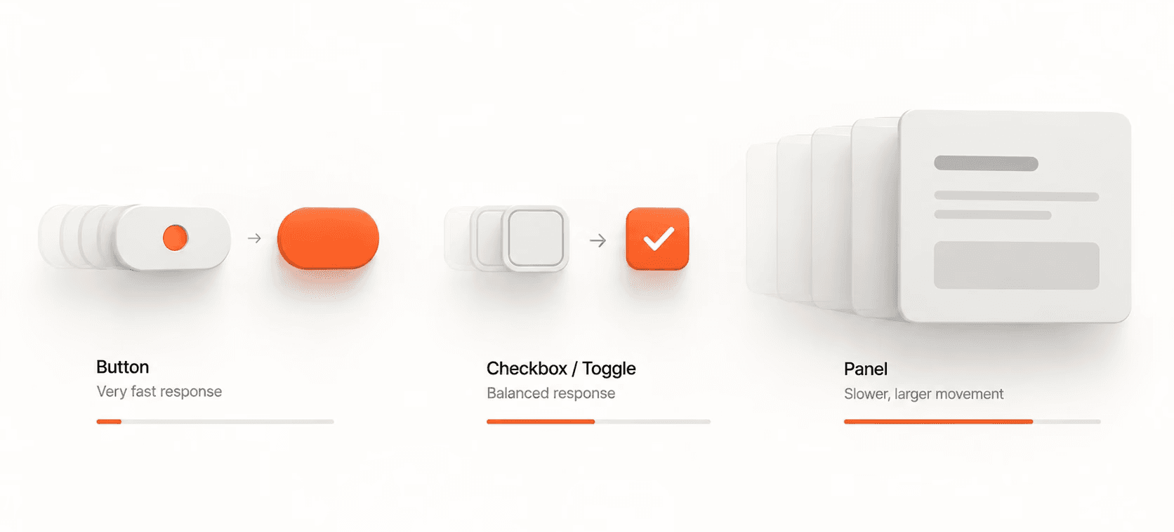
A checkbox should not take long enough for you to notice that it is animating. A button press should feel immediate because the user expects the interface to respond as soon as they touch it.
At the same time, a larger change needs more time to make sense. A modal entering the screen, a panel moving into place, or a major layout change might need much more time because there is more information for user to process and understand.
NNG suggests roughly 100–500ms for many interface animations, depending on how far something moves and how complex the change is. It also gives around 100ms as a useful starting point for simple feedback such as a checkbox or toggle, while many larger changes work well around 200–300ms.
I do not treat those numbers as rules, but I treat them as a starting point and confirm the interaction after eyeballing it.
A 100ms response can make sense for a small state change because the user should barely notice the delay. A larger transition can take longer when the movement helps explain where something came from or where it went. Apple also recommends keeping feedback motion brief and precise, especially for interactions people perform frequently.
The question I always ask: how much changed?
If nothing noticeably changed, then the response should be quick.
If the interface moved a large amount of content or changed the user's context, give the transition enough time to explain that change without making them wait.
Motion Must Match the Interaction
Another thing we must pay attention to is how the movement/animation itself relates to what just happened.
If a menu opens from the right, it makes sense for it to enter from the right. If a panel moves from one part of the screen to another, that movement will help the user better understand where it went.
But if something appears from a completely different direction, the animation starts telling a different story from the interface and that will confuse the user.
Apple's current motion guidlines makes this point clearly. Feedback should follow people's expectations and help them understand how something works. When an animation does not match the interaction, it can make the interface feel disorienting instead.
Thats the one reason I don't like adding random entrance animations to every element on a page or a screen you can also experience that on my portfolio.
Cause the movement should have some relationship to the action.
A menu can slide.
A state can change.
A confirmation pop up can appear.
A new panel can move into place.
The animation doesn’t need to tell a story every time; it simply needs to make the change easier for the user to follow.
A Simple Framework to Decide What Needs Motion
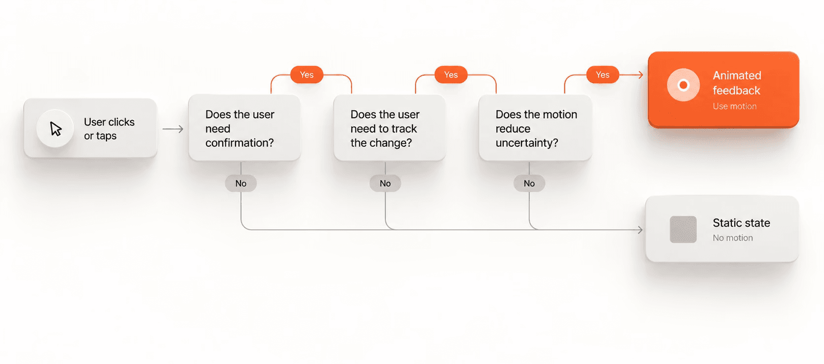
Before I add an animation, First I ask myself these 3 questions.
Does this change need to be confirmed?
If someone clicks a button and something changes, the interface should make that change easy to notice. This is especially important when there is a short delay between the users action and the result.
Does the user need help tracking where something went?
This is where movement can be useful. When a panel expands, a menu opens, or a piece of content changes position, then a short transition can help the user understand the relationship between the old state and the new state much easily.
Would removing the motion make the interface harder to trust?
This one is more subtle. When an action produces no visible response, people start wondering whether the system received it or not. Even a small state change can remove that uncertainty easily.
When none of those things apply, then I do not need any animation for that screen.
It can still be there as polish, but I would not make it a priority over fixing the interaction itself.
That is also why I think many best micro-interactions go unnoticed. They are doing their job without asking the user to stop and look at them.
Best Micro-Interactions Always Has Clear Reasons
I’ve been noticing that the interfaces we use the most don’t rely on flashy or impressive interactions. Instead, they have small responses in the right places, exactly where they make sense. I think that’s why they simply work. like apps like WhatsApp, Instagram, Figma and many other products.
For ex: a button makes it clear that it was pressed. A filter shows that it has been applied. A form tells us what needs fixing. A saved item changes state so we know the action happened. None of these interactions need fancy animations, and I think That's what makes them useful and practical.
This is where micro-interactions can make a product feel more considered without making the interface feel busy. They help remove small moments of uncertainty that people would have to solve on their own.
And because these interactions happen so often, even a small problem can become very annoying when repeat many times.
The same principle applies in reverse.
A small improvement that appears every time someone clicks a button or completes an action make the whole product feel easier to use.
Do Not Forget About Reduced Motion
There is one more part of interaction design that should not be treated as an afterthought.
Some people prefer reduced motion, and some kinds of animation can cause discomfort for people with vestibular disorders. WCAG 2.2 includes guidance that allows users to disable motion animation triggered by interaction unless the animation is essential to the information or function.
On the web, the prefers-reduced-motion media feature lets a site detect when someone has enabled a reduced-motion preference on their device. Modern browsers support it widely.
That means your interaction should still make sense without the movement.
If the button still changes state, the success message is still visible, and the user can still understand what happened, then removing the animation will not break the experience.
I think that is a good test for any motion-heavy interaction anyway.
Design the feedback first.
Use motion to make that feedback easier to notice.
Do not make the motion the only thing communicating what happened.
How I Use Interactions On My Projects
Before I start adding micro-interactions, I like to go through the important actions and mark down or add comments while I am designing in Figma like what the user needs to know after each action.
For a button, that will be “my click was registered” by showing the pressed animation. For a form, it will be “this was submitted” or “this field needs fixing.” For a menu, it will be “this opened and here is where it came from.”
Once that is clear, I start deciding whether the feedback needs motion, a state change, text, or any combination of these.
Then I like to keep the timing short enough so the interface never feels like it is making the user wait for an animation to finish. For larger transitions, I would give the movement enough time to explain the change without making it feel slower than the task itself.
At last, I test the interaction without the animation and with reduced motion enabled.
That tells me a lot more than watching the animation loop in Figma.
Resources that are worth your time
I think about micro-interactions and motion in UX, and these are the resources I recommend the most for reading rather than collecting a long list of theory.
The Role of Animation and Motion in UX by Nielsen Norman Group. A useful starting point for understanding when animation supports feedback, state changes, navigation, and usability.
Executing UX Animations: Duration and Motion Characteristics by Nielsen Norman Group. This is the one I keep coming back to for duration, easing, distance, frequency, and accessibility.
Microinteractions by Dan Saffer. It is older, but the basic model of triggers, rules, feedback, and loops is still a useful way to think about these small parts of an interface.
Human Interface Guidelines: Motion by Apple. I like this because it focuses heavily on purposeful motion, clear feedback, brevity, and matching movement to user expectations.
Human Interface Guidelines: Feedback by Apple. Useful when you want to think about feedback as more than animation and make sure people understand status, success, failure, and next steps.
Animation from Interactions by W3C. This is the reference I would use for the accessibility side of motion and reduced-motion preferences.
I don't think you need to follow any of these resources word for word, but they are good to help you master the fundamentals, and once you know the fundamentals, then it's much easier to break the rules intentionally to add some personality to your interactions.
Some insights and tips
I used to think micro-interactions were to make the interface feel polished, but now I see them as small pieces of communication between the person and the product.
When I click something, I should know whether it heard me or not; when something changes, I should be able to understand what changed; when something takes time, I should not be left wondering whether it is working or not.
That is what I want micro-interactions to do; in other words, they have to communicate.
The animation can make the experience visually better, but the real goal is to make the interface easier to understand and navigate.
If you are working on a website or any digital product and think that some of the interactions feel disconnected, unclear, or overly animated, I’m happy to help and guide you through what can be improved and how. We can look at what actually needs feedback, what can stay as it is, and where motion can make the experience much easier for users to understand and navigate.